This is another question that got a variety of interesting answers.
What I was going for is to put matches or lighters near the candles. If you’re rushing to get party supplies, you want the toothpicks that say “Happy Bday,” candles, balloons … and something to light the candles with. There isn’t even a note that says where the matches are. I had to find someone to tell me they were all the way on the other side of the store.
Other comments from the survey:
The items are pushed back. They should be close to the front of the peg.
There is no alignment among the different items.
Candles are on two pegs. But the top peg is clearly intended for something else. At $1.57 vs. $2.79, people would be upset.
Green is an ugly color for a background.
Although the focus of the question was on the retail display, I’d also fix the packaging/bundling.
For the candles, I’d include a few matches. Maybe use the back of the card for a striker.
The sparklers (the black things) look ridiculous and boring. From a distance, you have no idea what they are. I’d have a background with sparkles on it.
Our Victor Marks writes:
Use planogram software that reflects the actual size of items on the peg. The black item is taller and throws the whole display off. Also, don’t put pegs up so high that they ruin your header decoration (party)
There is a lot wrong with this display. But the biggest thing is that there’s no reason to put all of those gift cards behind the counter.
Gift cards are worth nothing until they are activated. There’s no reason to put them in a “secure” area. Many of these are impulse purchases. They should be placed somewhere prominent (endcaps are the most frequent placement) so people can browse them and find just the right gift card for the person they are buying for. Cigarettes and other high value items should be behind the counter; not things that have no inherent value.
Other things that are wrong with this display:
It looks like a cluttered mess.
There’s no discernible organization to the gift cards.
From a visual perspective, having the ToysRUs gift card hanging off on an acrylic shelf is ugly.
There’s a sign saying that gift cards are cash only. Walgreens POS is programmed to let store gift cards be sold by credit card.
This is among the worst Walgreens that I’ve been to. The overall merchandising at this store is poor.
Most are much nicer. Walgreens also does a great job at picking the right merchandise for each location — much better than most retailers.
There are a lot of things to love about this brochure for Consumer Cellular. The company is an MVNO focused on older consumers. For this segment, many of them are trying their first smartphone. The pricing (not included in the screenshot above) is designed to make it easy to try, with cheap plans and a low end, affordable phone.
Specifically in the screenshot:
They show images of people who look like the one they’re targeting. That’s repeated throughout the brochure.
They use large print, which is important for older people who might have trouble with eyesight.
They talk about voicemail, which many younger folks (including me) hate. But their target likely prefers voicemail to texting.
Chuck adds:
They relate to devices like answering machines, which their audience is familiar with.
Supposedly the Amazon app can scan real world objects. But Amazon requires you to manually enter the claim code. You should be able to scan a bar code or QR code to automatically apply the code to your account after logging in. OCR technology is also good enough that you should be able to scan the text as printed.
Amazon has a wide range of gift card products. Some of the responses focused on emailing gift cards and doing things electronically. Amazon already does that.
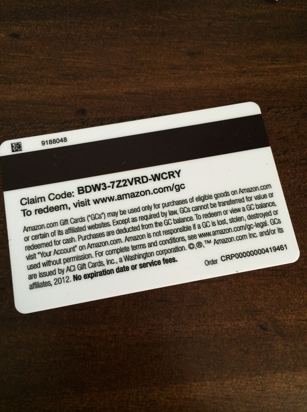
But Amazon also offers gift cards at retail and through incentive programs. This particular gift card was received through a credit card rewards program. I’m not exactly sure what the magnetic stripe is for, because I can’t swipe it on my computer. My best guess is that it’s for activation.
This particular card doesn’t have the scratch off; cards sold at retail do. (There used to be gift card fraud where crooks would copy down activation codes and wait for them to be activated.)
Print the card on card stock so it can be recycled or biodegrade. Whole Foods does this with their gift cards. I’ve seen other gift cards made of a plasticky corn based product.
Use all alphabetic characters. The intermingling of numbers and letters makes entering the code on mobile devices especially hard because you have to toggle between keyboards.
Make the print of the redemption code larger so that older folks or folks with vision issues can more easily read it.
iTunes already does this, making it easy to redeem Starbucks app and song of the week codes.
These are the icons for Software Update Microsoft System Center Configuration Manager 2007, fromhttp://technet.microsoft.com/en-us/library/bb632404.aspx
They are meant to show the states for Normal, Superseded, Expired, Invalid, and Meta-data only software updates.
What is the worst flaw in these icons?
And to look at them, you might say “nothing” or, “they’re all using arrows.”
But for the 1 in 12 men in the world and 1 in 200 women that suffer from color blindness, these icons look pretty similar, making it hard to discern the meaning.
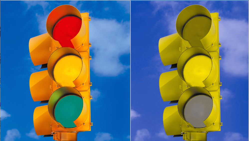
Here’s what it looks like using the color-blindness simulator Sim Daltonism.
Green and Yellow are hopelessly lost. Red and Gray, Red and Green aren’t fantastic, either.
Changing the type of color blindness simulation shows that it’s not a simple problem:
Here, Blue and Green are nearly the same.
Microsoft attempted to solve this in 2012 by using different badges on the icons instead of arrows for everything.
Note that Blue and Green are still both arrows, and are still going to be a problem for some percentage of the population.
Not everyone has to use System Center Configuration Manager, but this problem shows up in other applications. I asked someone close to me who deals with this everyday:
“Yes, but you cannot prevent other people from displaying bad Powerpoints and expecting you to make sense of them. I got to where (at a multinational Fortune 100 company) I would stop the speaker and ask him to identify each line on the graph or arrow on the picture.”
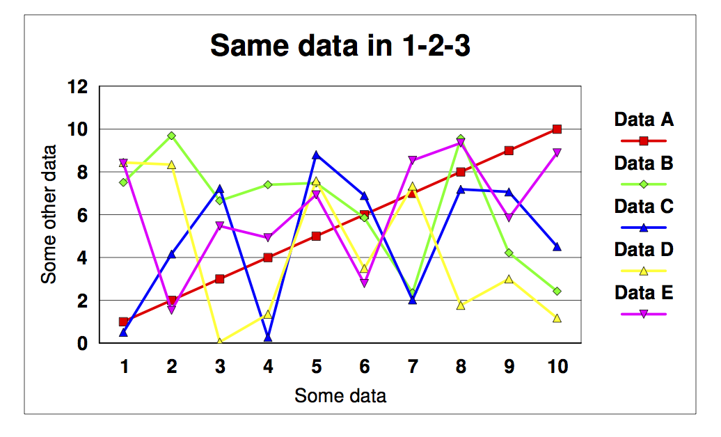
If you make a multivariate graph (multiple lines) in Excel, the color choices are bad (and cannot be easily changed). So you get three or four lines on the graph and cannot match lines to a key. One trick is to use big symbols at the data points (plus, square, circle, star) and in the key. Another is to force a color out by setting its values to all zeros, and adding another line in the next successive color, which doesn’t work well since all the colors are similar anyway.
Color test in Excel
The only color I can reliably distinguish is series 3, yellow. There are two dark blue ones which are distinct from all the others but not from each other. And people at (a multinational Fortune 100 company) did this all the time.
Color test in Lotus 1-2-3
Then, just for fun, I dumped the same data into Lotus 1-2-3. Not only were the default colors MUCH better, but by default the symbols were turned ON, not OFF.
So how do people with these problems get on in the world when traffic lights look similar?
Mostly, by relying on the position of the light displayed. Designers should consider all the tools at their disposal, color, size, position, and shape to help communicate that “these things mean very different things.”
There are all kinds of accessibility concerns to take into account beyond things like sight and hearing impairment, which most people read as blindness and deafness. It’s important to remember that it’s a continuum and there’s more that can be done than just addressing those two more easily-understood conditions.