I work with amazing people who are passionate about well-designed products. Success for me is when every part of the business that the customer touches has had careful attention paid to it.
I'm especially focused on accessibility for people with different abilities.
Target has a history of trying to keep their stores fresh, with user experiences and industrial design that is cohesive and friendly. They don’t always succeed, but the latest changes have been interesting, as Target upgrades their in-store price check experience. It’s important to focus on delivering the features people need, and not more.
One area where Target is trying to improve the user experience is the price check scanners that are placed around the stores, usually at the end of aisles, next to a red phone.
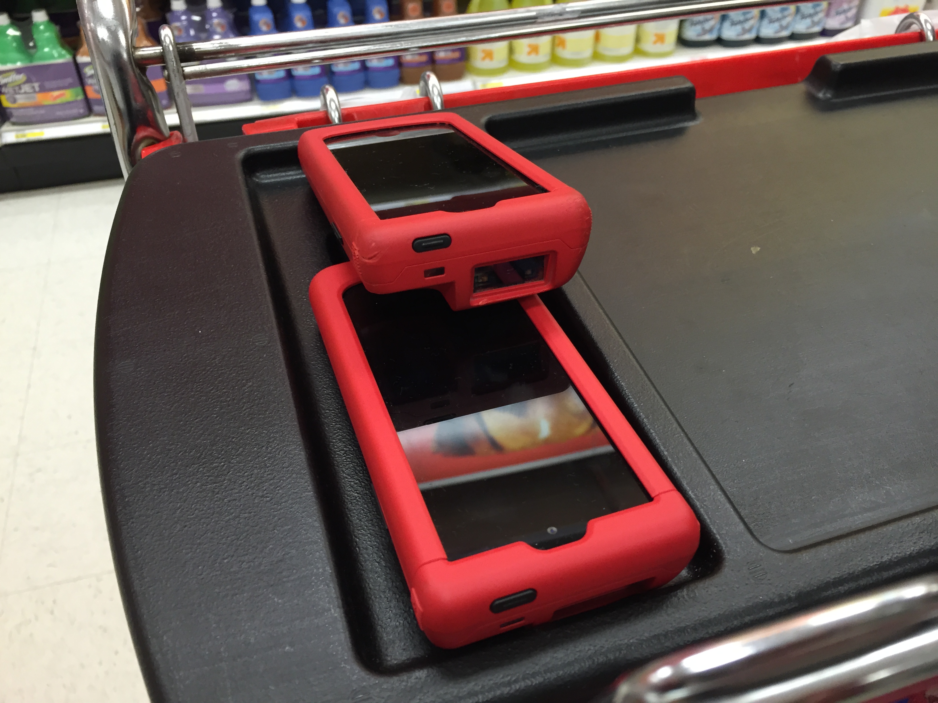
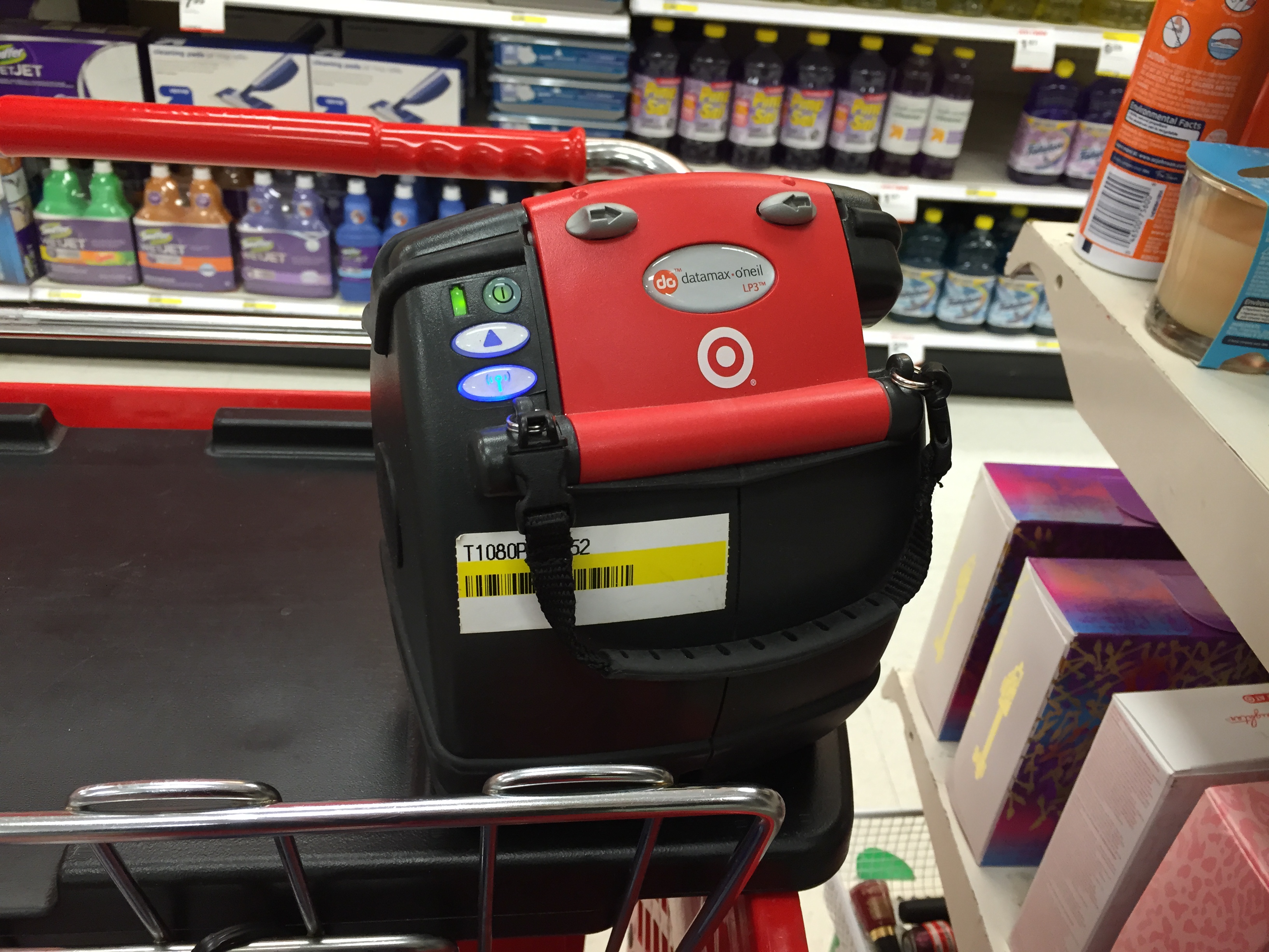
Target is no stranger to technology. They use iPod touch in custom cases with barcode scanners built in to manage inventory and print tags for the shelf with a wirelessly paired printer.
These are the icons for Software Update Microsoft System Center Configuration Manager 2007, fromhttp://technet.microsoft.com/en-us/library/bb632404.aspx
They are meant to show the states for Normal, Superseded, Expired, Invalid, and Meta-data only software updates.
What is the worst flaw in these icons?
And to look at them, you might say “nothing” or, “they’re all using arrows.”
But for the 1 in 12 men in the world and 1 in 200 women that suffer from color blindness, these icons look pretty similar, making it hard to discern the meaning.
Here’s what it looks like using the color-blindness simulator Sim Daltonism.
Green and Yellow are hopelessly lost. Red and Gray, Red and Green aren’t fantastic, either.
Changing the type of color blindness simulation shows that it’s not a simple problem:
Here, Blue and Green are nearly the same.
Microsoft attempted to solve this in 2012 by using different badges on the icons instead of arrows for everything.
Note that Blue and Green are still both arrows, and are still going to be a problem for some percentage of the population.
Not everyone has to use System Center Configuration Manager, but this problem shows up in other applications. I asked someone close to me who deals with this everyday:
“Yes, but you cannot prevent other people from displaying bad Powerpoints and expecting you to make sense of them. I got to where (at a multinational Fortune 100 company) I would stop the speaker and ask him to identify each line on the graph or arrow on the picture.”
If you make a multivariate graph (multiple lines) in Excel, the color choices are bad (and cannot be easily changed). So you get three or four lines on the graph and cannot match lines to a key. One trick is to use big symbols at the data points (plus, square, circle, star) and in the key. Another is to force a color out by setting its values to all zeros, and adding another line in the next successive color, which doesn’t work well since all the colors are similar anyway.
The only color I can reliably distinguish is series 3, yellow. There are two dark blue ones which are distinct from all the others but not from each other. And people at (a multinational Fortune 100 company) did this all the time.
Then, just for fun, I dumped the same data into Lotus 1-2-3. Not only were the default colors MUCH better, but by default the symbols were turned ON, not OFF.
So how do people with these problems get on in the world when traffic lights look similar?
Mostly, by relying on the position of the light displayed. Designers should consider all the tools at their disposal, color, size, position, and shape to help communicate that “these things mean very different things.”
There are all kinds of accessibility concerns to take into account beyond things like sight and hearing impairment, which most people read as blindness and deafness. It’s important to remember that it’s a continuum and there’s more that can be done than just addressing those two more easily-understood conditions.