
I have a new product manager that outperforms most mid-level PMs I’ve worked with. It’s faster, more thorough, and has ideas veteran PMs miss. It’s also an AI. As someone who has recruited and managed PMs for over a decade, this is what keeps me up at night.
To see how far AI has really come, I started feeding ChatGPT the same product design and strategy questions I use to interview human candidates to see how it would do. The answer: great. For most of the tasks, it has easily out-performed entry level PMs and PMs with 5-7 years of experience. It has come up with solutions that even veteran PMs haven’t. All for the low, low price of $20/month. And, of course, it does it faster.
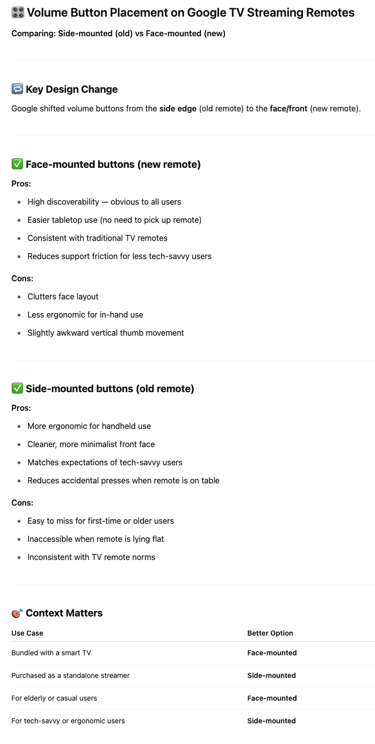
The humble volume buttons
Here’s one example: In the latest hardware refresh, Google moved the volume buttons on the remote for their TV streamer from the side of the remote to the face.

ChatGPT came up with the expected answers: the buttons on the side have become very familiar to users because that’s the way cell phone buttons work. It also lets the remote be smaller.
Putting the buttons on the face is more equivalent to traditional remote controls in terms of discoverability. That’s where they’ve always been. But it makes the remote substantially bigger. (See picture above.)
That’s where most PMs would stop. ChatGPT went into the details of tooling and manufacturing costs.
The absurdity test
I also did something I frequently do with PMs: suggest absurd ideas to see if 1) they understand that they are absurd 2) they are willing to push back.
I suggested doing a split test, with 5,000 units with the volume buttons on the side and 5,000 units with the buttons on the face.
Many junior PMs say “Sure, sounds like a good experiment.” They are trained to be data-driven.
Although that works well in a software environment, that’s a really bad idea for hardware. Doing a split run is prohibitively expensive due to tooling costs. You’d also have to come up with different packaging and marketing materials.
ChatGPT came up with the idea I was looking for: 3D print a few samples and bring in people to test them.
Absent that, ChatGPT recommended putting the volume controls on the side. So did Gemini. (If I meet the team who designed the new remote, I will definitely ask about the reason for the swap – and the swap of the home and assistant buttons.)
What does it mean for entry-level PMs?
I’m afraid the answer isn’t great. I can get $150k of productivity for $20/month. That’s not a tough call.
That begs the question: if there isn’t a pipeline for entry-level and mid-level PMs, where do senior level PMs come from? The best answer for now is that PMs need to expand their breadth to be able to handle more complexity: integrate design, development, business and systems level thinking into their repertoire.
As Scott Belsky says, taste becomes more important than ever.
So does the ability to see what the AI doesn’t: power dynamics, company incentives, unquantifiable friction — and what’s not on the roadmap, but should be.
A snippet of the ChatGPT response is below.