redesign | ux: How would you improve this Google Maps experience?

This quiz if focused on the items shown in the picture, specifically Budget and Avis. (Judging from the Twitter answers, that was unclear.)

Frequent travelers often rent cars. This involves picking up the car and eventually returning the car. Google could automatically track where you began your rental (in my case, Avis). When you want to return to the airport, instead of directing you to the airport terminal, it could automatically guide you back to the rental car return. One way to do this is to use GPS trace data. i.e. look at the paths of people who have rented from Avis and look at where they return the car.

Bonus points for showing me the last gas station on the route so that I don’t get stuck paying $9 a gallon to have the car rental company refill the tank. (Travel tip: You should almost never accept the prepaid fuel option.)

Some Twitter answers that reflect other issues with Google Maps.

https://twitter.com/Very_QC/status/555793461761564673

redesignAnswer: The trapezoidal package contained an iMac


From Skitch (3)


This package contained an iMac.

There are two things wrong with this packaging:

  • The trapezoidal shape doesn’t stack or fit well in delivery trucks.
  • Very few packages come in a trapezoidal shape. Thieves are more likely to notice this and assume that it contains a high-value item. (And they’d be right a large portion of the time.)

redesignQuiz: What is wrong with this packaging?

Difficulty: Easy

(HINT: In case you can’t tell from this image, the side is trapezoidal, not rectangular.)

From Skitch (3)

Provide your answer here.

redesignQuiz: I received these catalogs from Crate&Barrel and CB2 yesterday. What’s wrong?

Difficulty: Easy

photo (14)

Provide your answer here.

redesignAnswer: If you’re selling birthday candles, put matches or a lighter nearby

photo (10)


This is another question that got a variety of interesting answers.

What I was going for is to put matches or lighters near the candles. If you’re rushing to get party supplies, you want the toothpicks that say “Happy Bday,” candles, balloons … and something to light the candles with. There isn’t even a note that says where the matches are. I had to find someone to tell me they were all the way on the other side of the store.

Other comments from the survey:

  • The items are pushed back. They should be close to the front of the peg.
  • There is no alignment among the different items.
  • Candles are on two pegs. But the top peg is clearly intended for something else. At $1.57 vs. $2.79, people would be upset.
  • Green is an ugly color for a background.

Although the focus of the question was on the retail display, I’d also fix the packaging/bundling.

For the candles, I’d include a few matches. Maybe use the back of the card for a striker.

The sparklers (the black things) look ridiculous and boring. From a distance, you have no idea what they are. I’d have a background with sparkles on it.

Our Victor Marks writes:

Use planogram software that reflects the actual size of items on the peg. The black item is taller and throws the whole display off. Also, don’t put pegs up so high that they ruin your header decoration (party)


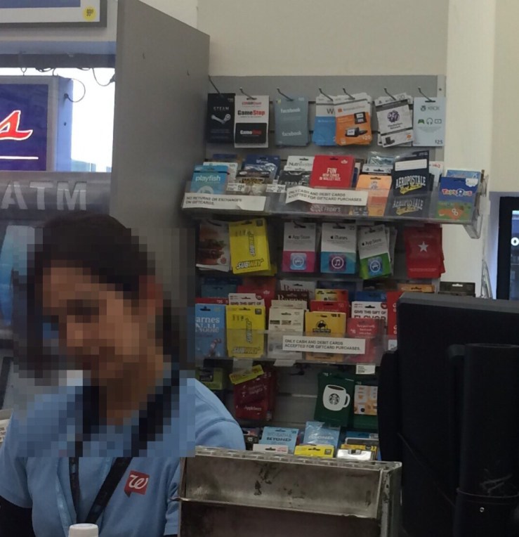
redesignAnswer: There’s no reason for Walgreens to put gift cards behind the counter

From Skitch


There is a lot wrong with this display. But the biggest thing is that there’s no reason to put all of those gift cards behind the counter.

Gift cards are worth nothing until they are activated. There’s no reason to put them in a “secure” area. Many of these are impulse purchases. They should be placed somewhere prominent (endcaps are the most frequent placement) so people can browse them and find just the right gift card for the person they are buying for. Cigarettes and other high value items should be behind the counter; not things that have no inherent value.

Other things that are wrong with this display:

  • It looks like a cluttered mess.
  • There’s no discernible organization to the gift cards.
  • From a visual perspective, having the ToysRUs gift card hanging off on an acrylic shelf is ugly.
  • There’s a sign saying that gift cards are cash only. Walgreens POS is programmed to let store gift cards be sold by credit card.

This is among the worst Walgreens that I’ve been to. The overall merchandising at this store is poor.

Most are much nicer. Walgreens also does a great job at picking the right merchandise for each location — much better than most retailers.

redesignAnswer: The brochure shows great market segmentation and creative

photo (9)


There are a lot of things to love about this brochure for Consumer Cellular. The company is an MVNO focused on older consumers. For this segment, many of them are trying their first smartphone. The pricing (not included in the screenshot above) is designed to make it easy to try, with cheap plans and a low end, affordable phone.

Specifically in the screenshot:

  • They show images of people who look like the one they’re targeting. That’s repeated throughout the brochure.
  • They use large print, which is important for older people who might have trouble with eyesight.
  • They talk about voicemail, which many younger folks (including me) hate. But their target likely prefers voicemail to texting.

Chuck adds:

  • They relate to devices like answering machines, which their audience is familiar with.