Today marks 20 years since Google changed the online mapping paradigm. Instead of Mapquest’s bitmapped maps, Google allowed superior control within the browser dynamically loading tiles.
I’ve been working in mapping and local products for longer than Google Maps has existed. Here are my observations of the industry, with a focus on Google.
The seed of Google Maps was an acquisition of an Australian company called Where 2.
Google Earth came from another acquisition, Keyhole.
When John Hanke, founder of Keyhole, asked Larry and Sergey to buy better imagery of the US, they asked how much it would cost to buy the whole world. They bought the whole world.
Before the acquisition, Keyhole was running out of money. They asked who on the team was willing to trade salary for more equity. Clearly, the latter group made out.
When Maps launched, the head of Mapquest at the time would often send all-hands emails to AOL employees about how no one would ever use Google Maps and how poor its traction was. (Somehow Mapquest is still around, but Yahoo! Maps is gone.) A lot of Mapquest’s dev team was based in Lancaster, PA. Lancaster is not the home of prime engineering talent and the product reflected it.
I was at a Google shareholder meeting where someone asked why Google was wasting so much money on Maps. The answer was essentially, “it’s our company, next question.” Of course it is now a key differentiator.
Amazon’s A9 division launched a version of Street View earlier than Google. Ironically, I was interviewing at Google at the time and one of my interviewers said “that will never scale.” (Even earlier than that, I launched street views for real estate in Minneapolis.)
The day Google announced turn-by-turn directions, Garmin shares plummeted. Google might have done Garmin a favor: Garmin instead focused on the more lucrative aviation, marine and sports enthusiast markets.
The launch of offline maps put another nail in the coffin of portable navigation devices that used to dot the windshields of cars across the country.
Google launched an extensive marketing campaign in Portland for Maps. I guess it wasn’t that successful because it wasn’t deployed elsewhere. I did get a lot of swag and some free drinks out of it.
As you would expect from Apple, the visualizations are gorgeous. The integration with Apple Watch and AirPods is brilliant for when I’m walking. I primarily use it when I’m walking, taking transit or renting a car (CarPlay). Unfortunately, the Tesla doesn’t allow CarPlay, so I’m stuck with an ugly version of Google Maps that looks like what Maps did in 2005 and worse than the later generations of PNDs.
Local is one of the most difficult problems out there. Businesses open and close all the time. (POI data is especially hard!) New roads get added. Construction temporarily re-routes roads. Roads are temporarily closed for events like marathons. Traffic data can be inaccurate.
Disclosure: I’m an investor in all of the public companies named. Mapquest is part of a Yahoo!, which is primarily owned by Apollo after another failed content play by Verizon.
The streaming revolution has entirely changed the way we consume video content. At our fingertips, in most parts of the world, we have access to large libraries of content.
Way more content than we could ever watch from MVPDs, much less OTA broadcasts. We can watch on-demand content from around the world. By aggregating niche interests and diasporas, it makes it more economically viable to create content. In our house, much of the content we watch is in Hindi and is original content created by Netflix. (Ironically, the Netflix hit Indian Matchmaking wasn’t available in Hindi last I checked. I expect that’s because there is a high degree of English fluency among Indians who watch that show.)
Despite the pandemic-era jokes about having watched all of Netflix (which according to estimates would take more than four years of nonstop viewing), you could never do it because new content is added all of the time.
You can watch something that will be interesting any time of day. You’re not stuck with infomercials if you’re up at 3 a.m.
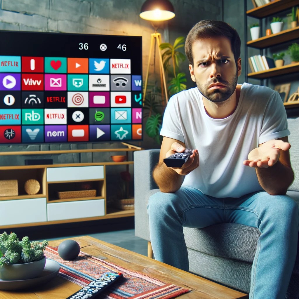
The big tradeoff has been degradation of the user experience. It used to be simple: want to go forward? Press the forward button. Rewind? Press rewind. Closed captioning? There was a button for that. It didn’t matter what channel you were watching or what program. It all worked the same.
Now each button – if there is even a button – works differently from device to device and from service to service. In some services, pressing skip goes forward 10 seconds; others 30 seconds. Want to turn on subtitles or a secondary audio track? Go digging through layers of menus, which again vary be service. And they might change when the service decides to redesign their app.
I’m an edge case for sure. On the device front, I have Apple TV, Chromecast, Roku, TiVo, Amazon Fire TV, Apple Vision Pro and the streaming services integrated into my Samsung TV. (Probably more in the junk drawer.) For services, I have Netflix, Apple TV+, Hulu, Disney+, Peacock, Max and YouTube. I’m also the only known subscriber to Paramount+.
The best user experiences feel invisible to the user. That’s definitely not the case in the streaming world.
There are a lot of ways to improve the streaming interface. (Personalization is a much more complex issue that I’ll visit in a future post.)
Here a few ideas:
Revisit the status bar
It drives me nuts that most video players, including YouTube, show how long a show is.
If something takes up space, it should provide meaningful information. The length of the video doesn’t change no matter how many times I look at it. What does change is how much of the video is left. It’s much more helpful to know that I have 0:35 remaining than that the video is 1:56 long.
Pick QWERTY or ABC
This is one more in the “drives me nuts” category. Pick QWERTY or ABC for searches. It shouldn’t vary when I search on different services. Again, there’s no competitive differentiation here.
My preference is QWERTY because the breaks are the same and ingrained from all of the typing we do. If you use ABC, I have to spend time looking around when you use 3 columns, 4 columns, etc.
I would expect that this has been A/B tested to death, but there is little reason to expect that the audiences would be so different across services.
Theoretically, the faster option would be speech. Unfortunately, speech recognition technology still works poorly in a namespace this broad. (Disclosure: I worked with Alexa speech recognition technology when I was at Amazon.)
Makes fast forward / rewind / skip / pause all work the same
The standard transport controls should perform the same. A skip is a skip. Pause is a pause.
There are two notable exceptions:
With AVOD (Ad-supported video on demand), the license might require you to disable skip during commercials.
Amazon Prime’s X-ray feature which provides information about the actors in the current scene. (Disclosure: I worked with X-Ray team when I was at Amazon.)
Retain state on closed captioning
When I switch from one service to another, the captioning should stay on (or off.) I shouldn’t have to find the controls (which are different) to turn it on or off. Ideally there would be a physical button.
This is another feature we’ve lost in the transition from a TV-driven interface to app-specific interfaces.
Store preferences for language
A lot of content comes in multiple languages. Some have multiple subtitles available, some have multiple audio tracks, others have both. I should be able to set a preferred language, instead of again having to search through menus. Regardless of what content I choose, the service should pick the language(s) I understand.
Like button
One of the hallmarks of our social world is the Like. Whether it’s a thumbs up, a like or a favorite, it’s an expression that we value something.
Platforms should have a physical Like button on their remote controls. TiVo started with thumbs up / thumbs down buttons on their iconic peanut remote. (Unfortunately the company is a shadow of its former self and has deprecated that functionality.)
Beyond providing data for personalization engines, the Like button could be turned into a social experience. In social co-watching environments, pressing the button could have an icon jump on the screens of the people I’m watching with.
Search by video length
This is especially important for the in-flight use case. I have 45 minutes left in my flight. What can I finish watching before touchdown?
To date, this has mostly applied to IFE systems. But with airlines like Delta and United adding bandwidth that supports streaming, this will become more important to online streaming services.
Even at home, I might want a 30-minute watch before I pick up the kids.
Have searches default to free
If I’m doing a search, I want free. Just because you can sell me a piece of content doesn’t mean I want to buy.
If it’s $5 on VOD, but available on a Subscription Video On Demand (SVOD) I have, I want the free one. You don’t even have to ask.
There are often business reasons/pressures to optimize for the one that generates revenue, but this would be very high up on the list of dark-pattern design. Charging people for things they should get for free has brand and regulatory risk.
Easy temporary connection
Another travel-related use case. More and more hotels are incorporating streaming services into their in-room TVs. Some even have dedicated Netflix buttons on the remote.
The difficulty comes in connecting your account, assuming you even have an account. You should be able to buy a day pass. (The service might even credit the cost of the day pass toward a subscription.)
Better profile handling
Platforms have profiles. Services have profiles. It’s a confusing mess. I can be logged into my Chromecast profile and my spouse’s Netflix profile. Ideally, if I log into my Chromecast profile, it logs into my Netflix profile.
Unlike the other improvements I’ve talked about, this has a lot of hair on it. There might not be a one-to-one matching of services and profiles. Some accounts aren’t shared, others are. Cost and service limitations might restrict some combinations.
All of this leads to poor personalization. My spouse and I share an Audible account. My spouse listens almost exclusively to romance titles; I mostly listen to books on product design, tech and finance. You can imagine what our personalization looks like!
There’s a reason I saved this one for last. Solving this is a lot harder than solving the rest.
Will these things ever happen? I hope so. At the same time, I’m not hopeful. Improving user experience is a cost, with the benefit harder to measure. It’s even more complicated when there are dozens of companies involved. Consumer Electronics Control (CEC) was introduced nearly 20 years ago and barely works today.
In the meantime, I’ll give you the same advice that I give to people who ask me how they should design their video apps: copy Netflix. It may not be the best in every area. But it’s the one that the most users have become most accustomed to.
Update: I asked ChatGPT to write a PRD based on this post. Here’s how it went.
The Apple Vision Pro is the best V1 of a product I’ve seen in a long time. But whenever you’re creating a completely new visual and input interface, you’re going to have some polishing to do.
There are some issues that are just the state of new technology and will get better over the course of time: weight, comfort, cost and stability being at the top of the list.
Eye tracking and gesture tracking is as good as I’ve seen, but it still needs improvement. This problem is exacerbated by the very subtle distinction among selected items. More on that below.
Some have complained that the AVP can cause nausea. I haven’t had that issue. The issue I have run into is the repeated use of the pinch gesture. It can cause my hand to get tired and I fear getting RSI. I had to take a break, not because of the weight of the headset but because my hands got tired. (This may also be an artifact of testing; if I were just watching a movie, this wouldn’t be an issue.)
Putting on my product manager and usability hat, here are the top new features and fixes I would make:
New features
Multiuser support
A $3,500 device should provide multiuser support. I can’t easily share it with my family. At a minimum, I should be able to switch among Apple Family Sharing users. AVP does have a guest mode, but it requires reconfiguration each time.
Importing iPad apps
As with all new hardware, initial software is going to be limited. Apple has some great demos and a few apps built by third-party developers that take full advantage of the AVP interface and features. But you’ll burn through them quickly.
AVP also supports iPad apps. They don’t provide the same rich experience as native apps, but they do provide valuable features. Notably, most of the frequently used Apple apps haven’t been re-written for AVP.
AVP allows you to go through the App Store and manually select iPad apps. It would be better if it provided a list of your most frequently used apps to add them with a few clicks.
Automatic free trials
Out of the box, users should have 7- to 30-days of free access to all of the AVP optimized apps. This would give them the ability to really experience the power of the platform.
I had the same issue with Oculus. In order to fully understand the device, I had to buy a lot of games. I wasn’t going to do that.
Demo/training mode
Unlike most products, it’s hard to teach someone to navigate the interface. AVP already has a screen mirroring feature that allows someone else to see what the AVP pro is seeing.
When I’ve shown friends how to use the AVP, I’ve had to say “look all the way to the right, look down, see that?”
Add a “laser pointer” to that mode. Instead of having to talk the directions, I could have a pointer appear on the screen to guide them. You could all add a reverse pointer, where the trainer could see where the eyes are looking.
Fixes and tweaks
Setting up AVP
For initial setup, the AVP requires that you hold your iPhone near it to download account credentials. It’s unclear how far you need to hold it. I found myself repeatedly moving my arm forward and backward while trying to pair it.
Sample content
When you try AVP in store, there are some gorgeous pictures that are shot for purpose. They show off spatial video and photos, panoramas and other features of the device. At the risk of pulling a U2, those sample images and videos should be included in the Photos app. (Possibly in a folder labeled Sample Content, in much the same way that Windows included sample pictures.)
My initial reaction when I saw those pictures: I need to buy an iPhone 15 Pro so that I can capture spatial photos.
Too little differentiation between items when selecting
This is one of the biggest usability issues. The difference between selected and non-selected items is very slight. For a device that requires looking at an item to pick it and where you don’t have precision control like with a mouse, this is a big problem. It’s especially a pain when using the on-screen keyboard. (See more below.)
I thought this would be changeable in accessibility settings, but I couldn’t find it. Regardless, the default differentiation needs to be greater and some users would benefit from being able to set it even higher.
Keyboard
Hate the on-screen keyboards where you have to navigate with a remote control to enter data? The AVP’s virtual keyboard is at least 10 times more difficult than those. It took me 5 minutes just to enter my Disney+ login information. There were too many misread keystrokes.
For AVP to be a content production device, the keyboard needs to be much better. Yes, you can pair a physical bluetooth keyboard, but that’s yet another accessory to carry with you.
Top left menu item is really difficult to access
AVP has a side panel that is used to navigate among key controls. Selecting the top item was very difficult. Given that the item is “Applications,” this really needs to be improved.
I initially thought it was an eye tracking problem for me, but I had a friend try it and he had the same issue.
Control Center too hard to get to
Similar to the above issue. As with iPhone, the Control Center comes down from the top. The way it is supposed to work is that you look up and can select it. Frequently, I put my head back as far as my neck would allow and I still couldn’t get the Control Center tab to come up. Again, my friend had the same issue.
At other times, it’s a gnat that I can’t swat away.
Lack of progress indicator when launching apps
Sometimes there is a delay when trying to launch an app. Because the background is a passthrough of what your eyes are looking at, it feels like something crashed or that the app didn’t launch. A spinner or loading indicator would make this a more comfortable experience.
Universal transport controls
This isn’t AVP specific, but it has long been on my video wishlist, and with a change to a completely new environment, maybe I can finally get it.
I want rewind, fast forward, play, pause, skip, go back and other transport controls to work the same regardless of which video app I’m in.
I want the numbers on the right side to reflect how much time is left in the video I’m watching. (Showing the total duration isn’t very helpful. It’s also not a good use of space: the number doesn’t change.) When I press skip, I don’t want it to go forward 5 seconds in one player, 15 seconds in another and 30 seconds in another.
My cable TV and DVR remotes didn’t work differently depending on what channel I was watching. This is the same. Transport controls aren’t a competitive differentiator. Unless there is an app-specific feature (like Prime Video’s X-ray), they should work the same.
The only exception is the skip feature during ads. That control can be disable during an ad and not shown on ad-free services.
Spend even 30 minutes with the Apple Vision Pro and you’ll be impressed. I’ve largely given up trying new hardware at launch because it is hard to set up, buggy and overall so frustrating that it’s not worth the hassle.
It’s the best V1 of a new product that I’ve seen in a long, long time. The included demos are amazing. You can feel yourself walking alongside dinosaurs or walking on a rope suspended above water. You can watch a Disney movie inside the Disney theater in Hollywood; the movie is presented on a giant screen around a model of the theater.
(Incidentally, I was part of market research study sponsored by Apple a few years ago. Based on the tests they did and the scans they took of my face, it was most likely for development of the AVP.)
The current headset is roughly 1 1/2 pounds. It’s a bit uncomfortable to wear for more than 30 minutes. Some people have complained that they feel nauseated from the experience, but I didn’t have that issue. (If you get dizzy watching IMAX movies or at Disneyland video rides like Avatar, you might want to sit this one out.)
Apple, true to form, nickel and dimes you. A case is $200. A belt clip is $50. Both are necessary. Without a case, you could easily end up with a $2,500 repair bill. This is not a device you just want to throw in your backpack. You’ll need the belt clip if you want to stand up and walk around.
The biggest challenge, besides the price, is the lack of software. Once I finished with the awe-inspiring demos, I was left with the question “what next?” What can I do that is significantly better than on other devices that don’t cost $3,500? The answer today is not much. Certainly not enough for me to keep the device. (I’ll be returning it to Apple.) But I envision a lot of use cases as the price comes down, the device gets lighter and it becomes more comfortable.
Video
With the gorgeous screens, it’s a great device for entertainment. But only if you like Apple TV+, Disney or Max. Want Netflix, YouTube or Peacock? You’re out of luck. If I’m Netflix, I hold back launching on AVP. Apple needs them. It’s a great leverage point for negotiations to reduce the vig Apple takes on in-app subscriptions. Right now, it’s not like Netflix is going to get additional subscribers by launching on AVP. If you can throw down $3,500 for an AVP, there is a very strong chance you already have Netflix.
Usage of in-home video consumption has changed dramatically over the last decade. It’s no longer immersive. People are frequently multitasking, using second and third screens to check email, engage with social media and play games. Video consumption is also frequently done with other people – each person in a family using a $3,500 headset seems unlikely. It’s not as immersive, but I can buy a 65″ OLED TV, premium Sonos sound system and Chromecast for less than that, and everyone in the room can watch.
I also had trouble drinking while wearing the headset because the can bumped up against it.
Games
Any device this powerful will inevitably be used for games, the screens alone will create an immersive experience.
The big challenge here is that it’s competing with Oculus. There are hundreds of games already available. At 1/10 the price of an AVP. The price dramatically reduces the TAM for game developers. Unless you can port a game from Oculus for next to free, it’s not worth doing it yet.
Another challenge is the lack of controllers. Apple’s pinch interface isn’t suitable for a lot of games. I expect that eventually Apple will support other gestures and controllers.
Training
This is where I see the biggest bang for the buck at today’s price. To the extent that it can reduce the costs or improve the quality of training, it can pay for itself.
Imagine applications like training surgeons or auto mechanics. They could practice in a realistic space without damaging real equipment or needing a lot of cadavers.
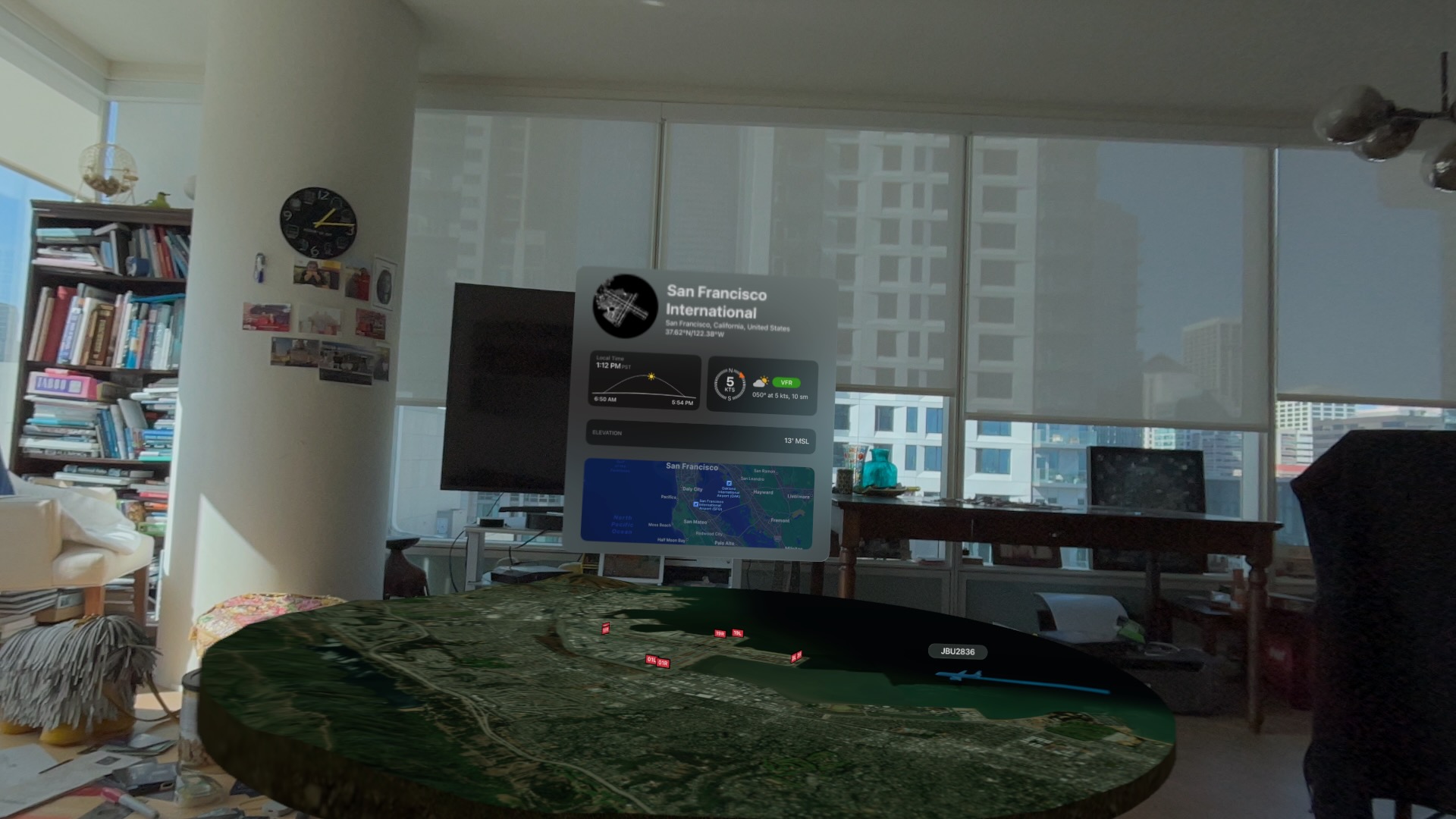
Travel
I love to travel. I’ve visited hundreds of cities around the world, awed at the spray and noise of Iguazu Falls in Argentina and hiked to Machu Picchu. Unfortunately, not everyone has the time, resources or physical ability to do that.
Apple has created a maps product that in most ways exceeds Google Maps in the United States. I’m surprised that Apple didn’t create at least a beta version of the 3D views it has captured for Apple Maps. Not only would it show off the AVP, it would show off how much further ahead Apple Maps has gotten.
Work
I’m not a believer in the widely discussed sit-around-in-a-virtual-conference-room use case for AR/VR that is often touted. It isn’t additive. People already tire of Zoom meetings where the only impression on them is a camera. Add in a 1 1/2 pound headset? No way.
But there are plenty of other applications that would actually use the capabilities. Imagine a surgeon seeing an overlay of an MRI on her patient in the OR. An air traffic controller guiding planes in real time with a 3D view of aircraft and terrain. (I 😂 as I write this given how ancient the technology FAA uses is, but a guy can dream.)
More immediate use cases:
Architects placing renderings of a building in a downtown to show to zoning boards.
Urban planners showing residents what a new park would look like.
Utility workers identifying buried power lines.
AR view of a flight tracker app on Apple Vision Pro.
Porn
(Feel free to skip this section; I include it for completeness.)
Let’s face it – porn will be a common use for the AVP. Porn has driven the adoption of many emerging technologies, including the VCR, DVD players and even the Internet itself. I expect point-of-view porn to be especially compelling.
Because it is a closed ecosystem, you’re unlikely to get native porn. Just like with iPhone and iPad, Apple won’t allow developers to create porn apps. For now, the Web browser or Photos app will have to suffice.
Although most Web pages are 2D, there are emerging toolkits that will allow 3D. The Photos app in AVP displays 3D spatial photos and videos. If I were shooting porn today, I’d use an iPhone 15 Pro to capture spatial video so that I have a library ready to go as adoption of the AVP increases.
I can envision so many other possibilities for the Apple Vision Pro. If we get even half of them, Apple will has pushed the world forward.
The E indicator in the status bar, showing that the phone is on and Edge network.
The stuck “Sending…” indicator.
My answer here is to fall back to SMS when the data network doesn’t work. Apple has created its own messaging system that runs over your phone’s data connection. In most cases, this is good. It allows Apple to deliver a richer set of features, free international messaging and can be faster.
But SMS is more robust because it uses a separate signaling channel. (This is why you should use SMS in emergency situations.)
One of my frustrations with a lot of mobile design is that it ignores low-bandwidth use cases. That’s important for areas where there is sparse coverage. It’s also important if you want your app to work reasonably well in international markets.
Some other answers from Twitter:
@rakeshlobster Present a preview image of website so users know what they'll get (although auto fetching URL may annoy some with data caps)


