
The streaming revolution has entirely changed the way we consume video content. At our fingertips, in most parts of the world, we have access to large libraries of content.
Way more content than we could ever watch from MVPDs, much less OTA broadcasts. We can watch on-demand content from around the world. By aggregating niche interests and diasporas, it makes it more economically viable to create content. In our house, much of the content we watch is in Hindi and is original content created by Netflix. (Ironically, the Netflix hit Indian Matchmaking wasn’t available in Hindi last I checked. I expect that’s because there is a high degree of English fluency among Indians who watch that show.)
Despite the pandemic-era jokes about having watched all of Netflix (which according to estimates would take more than four years of nonstop viewing), you could never do it because new content is added all of the time.
You can watch something that will be interesting any time of day. You’re not stuck with infomercials if you’re up at 3 a.m.
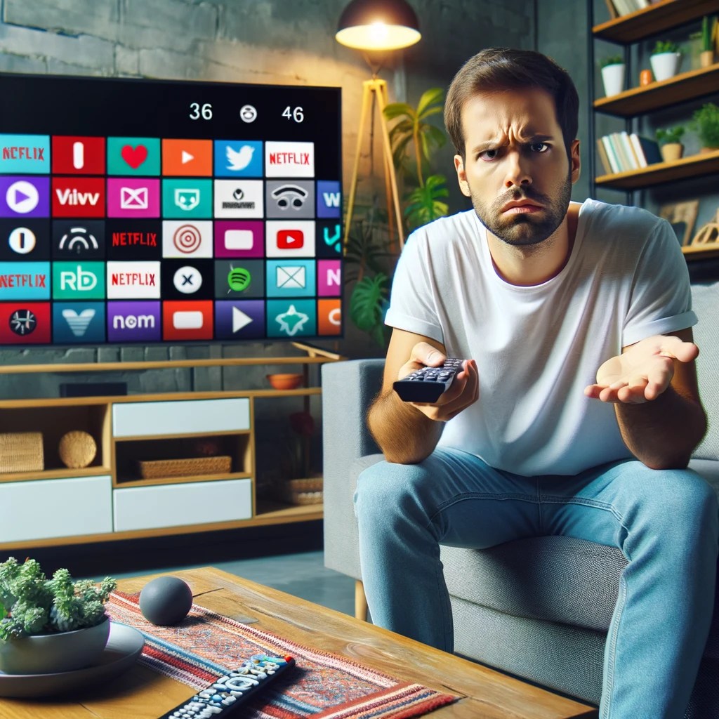
The big tradeoff has been degradation of the user experience. It used to be simple: want to go forward? Press the forward button. Rewind? Press rewind. Closed captioning? There was a button for that. It didn’t matter what channel you were watching or what program. It all worked the same.
Now each button – if there is even a button – works differently from device to device and from service to service. In some services, pressing skip goes forward 10 seconds; others 30 seconds. Want to turn on subtitles or a secondary audio track? Go digging through layers of menus, which again vary be service. And they might change when the service decides to redesign their app.
I’m an edge case for sure. On the device front, I have Apple TV, Chromecast, Roku, TiVo, Amazon Fire TV, Apple Vision Pro and the streaming services integrated into my Samsung TV. (Probably more in the junk drawer.) For services, I have Netflix, Apple TV+, Hulu, Disney+, Peacock, Max and YouTube. I’m also the only known subscriber to Paramount+.
Multiple services and devices is fairly common. The average American household has four SVOD (subscription videos on demand) services. That’s a lot of complexity and user frustration.
The best user experiences feel invisible to the user. That’s definitely not the case in the streaming world.
There are a lot of ways to improve the streaming interface. (Personalization is a much more complex issue that I’ll visit in a future post.)
Here a few ideas:
Revisit the status bar
It drives me nuts that most video players, including YouTube, show how long a show is.

If something takes up space, it should provide meaningful information. The length of the video doesn’t change no matter how many times I look at it. What does change is how much of the video is left. It’s much more helpful to know that I have 0:35 remaining than that the video is 1:56 long.
Pick QWERTY or ABC
This is one more in the “drives me nuts” category. Pick QWERTY or ABC for searches. It shouldn’t vary when I search on different services. Again, there’s no competitive differentiation here.
My preference is QWERTY because the breaks are the same and ingrained from all of the typing we do. If you use ABC, I have to spend time looking around when you use 3 columns, 4 columns, etc.
I would expect that this has been A/B tested to death, but there is little reason to expect that the audiences would be so different across services.
Theoretically, the faster option would be speech. Unfortunately, speech recognition technology still works poorly in a namespace this broad. (Disclosure: I worked with Alexa speech recognition technology when I was at Amazon.)
Makes fast forward / rewind / skip / pause all work the same
The standard transport controls should perform the same. A skip is a skip. Pause is a pause.
There are two notable exceptions:
- With AVOD (Ad-supported video on demand), the license might require you to disable skip during commercials.
- Amazon Prime’s X-ray feature which provides information about the actors in the current scene. (Disclosure: I worked with X-Ray team when I was at Amazon.)
Retain state on closed captioning
When I switch from one service to another, the captioning should stay on (or off.) I shouldn’t have to find the controls (which are different) to turn it on or off. Ideally there would be a physical button.
This is another feature we’ve lost in the transition from a TV-driven interface to app-specific interfaces.
Store preferences for language
A lot of content comes in multiple languages. Some have multiple subtitles available, some have multiple audio tracks, others have both. I should be able to set a preferred language, instead of again having to search through menus. Regardless of what content I choose, the service should pick the language(s) I understand.
Like button
One of the hallmarks of our social world is the Like. Whether it’s a thumbs up, a like or a favorite, it’s an expression that we value something.
Platforms should have a physical Like button on their remote controls. TiVo started with thumbs up / thumbs down buttons on their iconic peanut remote. (Unfortunately the company is a shadow of its former self and has deprecated that functionality.)
Beyond providing data for personalization engines, the Like button could be turned into a social experience. In social co-watching environments, pressing the button could have an icon jump on the screens of the people I’m watching with.
Search by video length

This is especially important for the in-flight use case. I have 45 minutes left in my flight. What can I finish watching before touchdown?
To date, this has mostly applied to IFE systems. But with airlines like Delta and United adding bandwidth that supports streaming, this will become more important to online streaming services.
Even at home, I might want a 30-minute watch before I pick up the kids.
Have searches default to free
If I’m doing a search, I want free. Just because you can sell me a piece of content doesn’t mean I want to buy.
If it’s $5 on VOD, but available on a Subscription Video On Demand (SVOD) I have, I want the free one. You don’t even have to ask.
There are often business reasons/pressures to optimize for the one that generates revenue, but this would be very high up on the list of dark-pattern design. Charging people for things they should get for free has brand and regulatory risk.
Easy temporary connection
Another travel-related use case. More and more hotels are incorporating streaming services into their in-room TVs. Some even have dedicated Netflix buttons on the remote.
The difficulty comes in connecting your account, assuming you even have an account. You should be able to buy a day pass. (The service might even credit the cost of the day pass toward a subscription.)
Better profile handling
Platforms have profiles. Services have profiles. It’s a confusing mess. I can be logged into my Chromecast profile and my spouse’s Netflix profile. Ideally, if I log into my Chromecast profile, it logs into my Netflix profile.
Unlike the other improvements I’ve talked about, this has a lot of hair on it. There might not be a one-to-one matching of services and profiles. Some accounts aren’t shared, others are. Cost and service limitations might restrict some combinations.
All of this leads to poor personalization. My spouse and I share an Audible account. My spouse listens almost exclusively to romance titles; I mostly listen to books on product design, tech and finance. You can imagine what our personalization looks like!
There’s a reason I saved this one for last. Solving this is a lot harder than solving the rest.
Will these things ever happen? I hope so. At the same time, I’m not hopeful. Improving user experience is a cost, with the benefit harder to measure. It’s even more complicated when there are dozens of companies involved. Consumer Electronics Control (CEC) was introduced nearly 20 years ago and barely works today.
In the meantime, I’ll give you the same advice that I give to people who ask me how they should design their video apps: copy Netflix. It may not be the best in every area. But it’s the one that the most users have become most accustomed to.
Update: I asked ChatGPT to write a PRD based on this post. Here’s how it went.
