
Difficulty: Moderate.


There are a lot of things to love about this brochure for Consumer Cellular. The company is an MVNO focused on older consumers. For this segment, many of them are trying their first smartphone. The pricing (not included in the screenshot above) is designed to make it easy to try, with cheap plans and a low end, affordable phone.
Specifically in the screenshot:
Chuck adds:
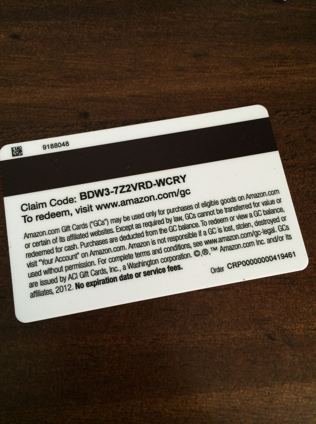
Supposedly the Amazon app can scan real world objects. But Amazon requires you to manually enter the claim code. You should be able to scan a bar code or QR code to automatically apply the code to your account after logging in. OCR technology is also good enough that you should be able to scan the text as printed.
Amazon has a wide range of gift card products. Some of the responses focused on emailing gift cards and doing things electronically. Amazon already does that.
But Amazon also offers gift cards at retail and through incentive programs. This particular gift card was received through a credit card rewards program. I’m not exactly sure what the magnetic stripe is for, because I can’t swipe it on my computer. My best guess is that it’s for activation.
This particular card doesn’t have the scratch off; cards sold at retail do. (There used to be gift card fraud where crooks would copy down activation codes and wait for them to be activated.)
iTunes already does this, making it easy to redeem Starbucks app and song of the week codes.
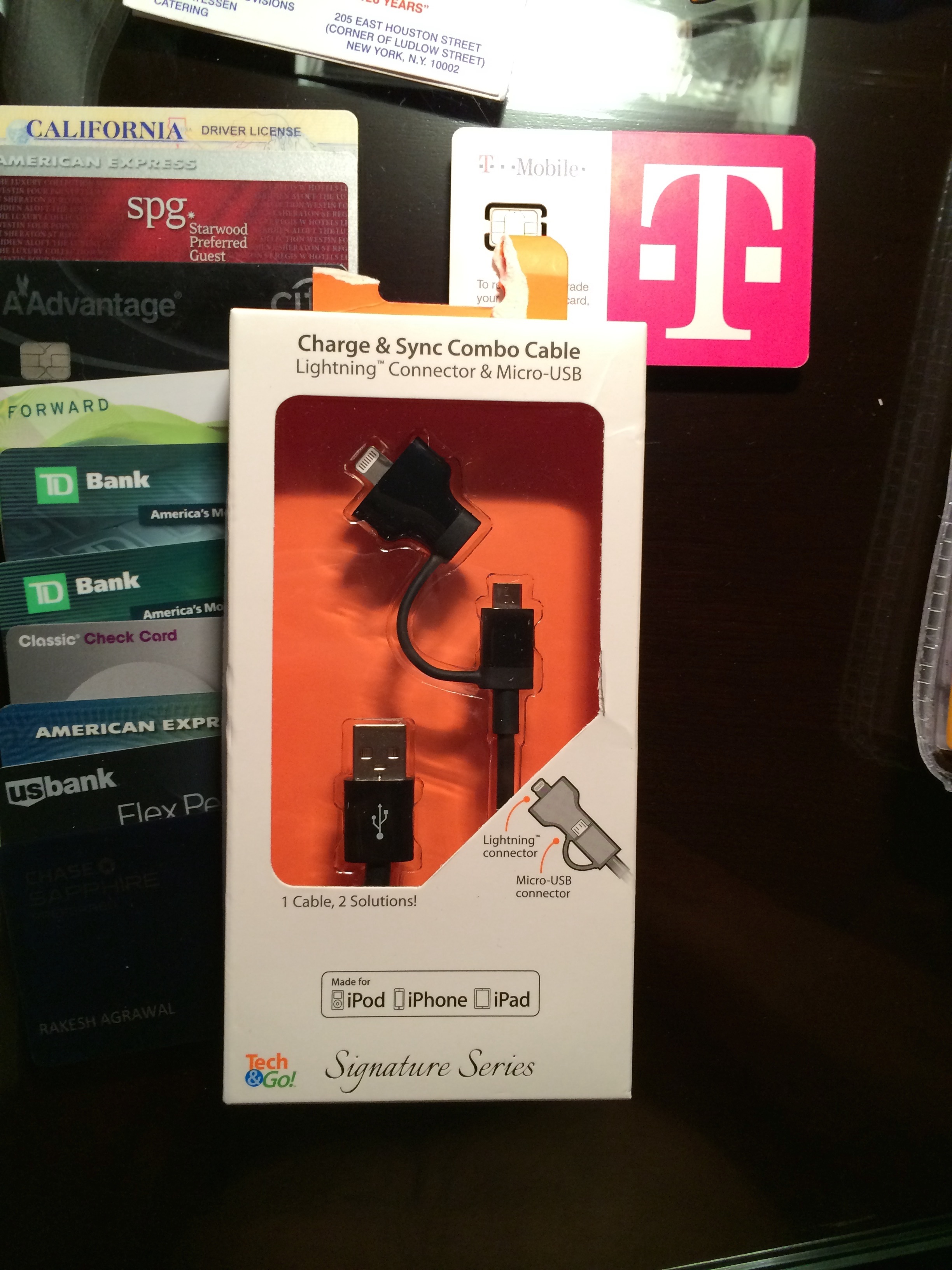
The tab on this cable is broken because it was locked to the peg. There was a customer service button to press; I pressed it. A store clerk walked by but didn’t have the key; I asked her to find someone who did. 15 minutes later, I gave up and ripped off the tab. (I did pay for the merchandise.)
But most consumers wouldn’t wait more than 2 minutes. So this “security” measure deters sales.
It also doesn’t deter theft! If someone wants to steal it, they can just do what I did. Another alternative is to pull the peg entirely out of the peg board and remove it from the back.
So you’ve made it hard for legitimate customers to buy the product while only adding a speed bump for thieves.
This is also a case where the maxim about letting your data make your decisions falls flat. Such analysis ignores what you can’t measure. In this case, it is lost sales. You can measure theft — number of units put on display minus number sold. Measuring opportunity cost — the units you didn’t sell because people didn’t want to wait — is harder. (Though it can be done.)
Opportunity cost in this case is especially high because this a high margin product. Every lost sale hurts more than every theft.
Of course, Walgreen’s could improve service levels so that someone would actually come and unlock the product. But that requires more staffing.
Another answer, which Sam came up with, is that the item was on a peg with assorted merchandise. Rather than slide everything out to get to the one she wanted in back and then slide everything back on, she’d just rip the tab for the one she wanted.
Imagine two borrowers.
Borrower 1
Borrower 2
Who is the better credit risk? Most humans would say borrower 2.
But the FICO scoring model would say borrower 1.
The fundamental flaw in FICO is that it doesn’t take into account the income or assets of the borrower. It focuses on things like credit utilization, recent inquiries, etc. Someone who makes $500,000 looking for a $25,000 line of credit is more likely to be able to repay that loan than someone who makes $30,000.
The FICO model has many, many flaws. Another significant one is that it often creates scenarios where doing the economically optimal thing reduces your FICO score. We’ll cover that in a later quiz.
Like many marketing and pricing questions, this one doesn’t have a “right” answer. It depends on the philosophy of the company and what you’re trying to achieve.
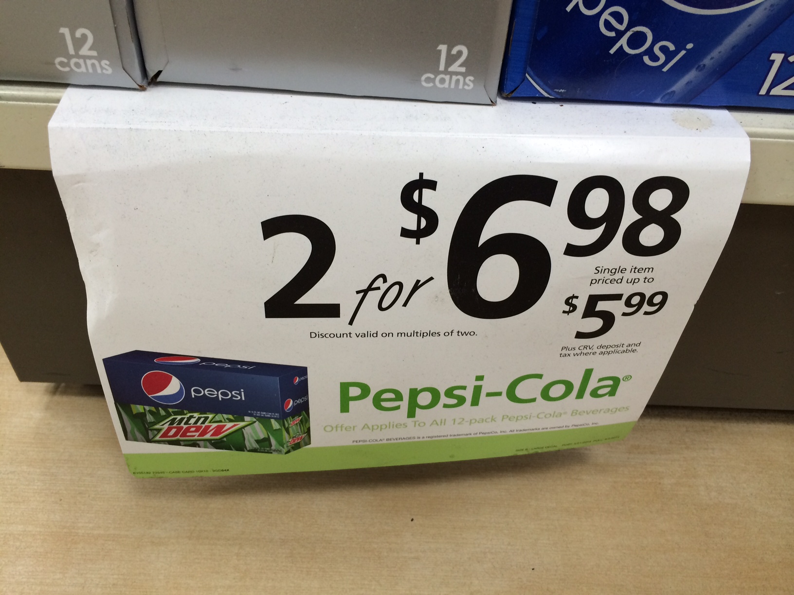
Here, you’re balancing the consumer desire for “fairness” with the desire to maximize either revenue or margin.
The “fair” answer is $3.49, which is exactly half of the cost for two. The revenue maximization answer is $6.97, because it basically forces everyone to buy two.
There are other considerations, too:
In general, I find that stores like Target tend toward the “fair” end of the spectrum in unit pricing. Drug stores such as, Walgreen’s and CVS, and C-stores, like 7-11, tend toward the revenue maximization.
The picture in the question was taken at a 7-11. The price for two was $6.98. The price for one was “up to $5.99” on the sign. I didn’t try to buy a single unit just to see what the actual price was.

PenFed sent me a new Visa without asking. Why?
In one case, it is “Platinum”. In another it’s “Signature.”
The interchange rates for Signature cards are substantially higher than for Platinum cards. The issuing bank can make a lot more on transactions simply by “upgrading” the customer to Signature. This is virtually no cost, aside from re-issuing the cards. There are a bunch of services that come with Signature status (like concierge), but these are low-use services of marginal value.
… to add the color of the vehicle.
Having the picture of the driver, type of vehicle or license plate number isn’t useful when you’re trying to spot the car from a block and a half way.
You can see color from a block and a half or two blocks. (Depending on the size of the blocks, of course.) If you’re well versed in vehicle models, you might be able to see it from half a block or a block. (Unless it’s a Prius, of which there are many.) You certainly can’t read the license plate until the driver is a few feet away.
The driver’s picture is useless until the driver is right in front of you. Maybe when the driver is within 10-20 feet, the map and the vehicle info zooms into a picture of the driver.
Putting the color of the vehicle would be a huge improvement.
It would make it easer:
It would also prevent incidents like what happened to me on Sunday — the driver sped past me at at least 30 mph. And then backed up several hundred feet in one-way traffic. Clearly unacceptable in my book.
